Just enough feedback
Just enough feedback
Once a transaction has started, beware of providing your user with too much information or too much feedback. Users questioned the value of being told everything that was going on, especially when they weren't familiar with the technology.
When you download content from a service like Netflix, you don't get a play-by-play explanation of how that content makes its way from the cloud to your device. Or when you send money via your bank, you aren't able to trace it as it makes its way through the various systems to your desired recipient.
Less is more
With Ethereum, you're able to get a lot of information about where the transaction is in the lifecycle e.g. sent to the mempool, picked up by a miner and being mined. But just because you can, doesn't mean you should. Most users we spoke to were only interested in three things:
- Has it started?
- What progress is it making?
- Is it done?
Use the demo to see how we designed for these three needs. Devcon demo
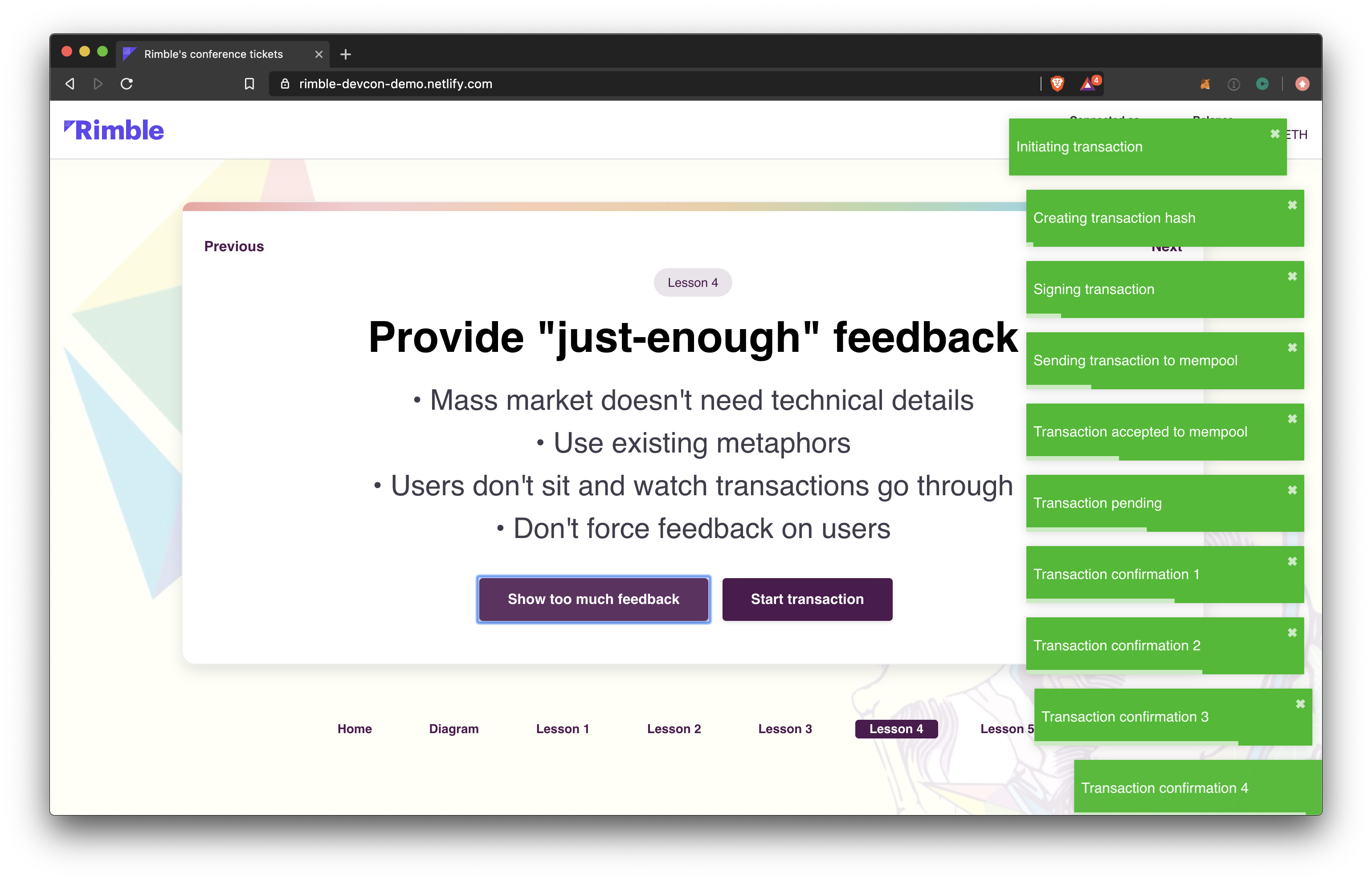
And here's what it looks like when you bombard your users with transaction feedback:

In our testing, most users didn't stick around to watch their transaction finish either. They quickly switched tabs to complete other tasks, only to come back every now and then to check on progress. So any extra messaging has a strong chance of being missed.
Prioritise just enough feedback and keep it relevant to the task at hand:
- Your ticket is on its way
- Transferring your ticket
- You're going to Devcon
- Transaction started
- Transaction pending
- Transaction being mined
- First block mined
- Transaction done
Make it optional
It's also important to question whether you need to lock users into watching their transaction go through. As part of our demo we designed a minimised state, so that users could continue to interact with the product while keeping an eye on their transaction. They weren't forced into watching their transaction complete via a modal.

And if you can't read the banner in the above screenshot:
