Prevent errors
Prevent errors
Blockchain transactions are irreversible and errors are easy to make.
Common errors include:
- transacting on the wrong network
- using the wrong account
- not having enough ETH in your wallet for a transaction.
Because these can be frustrating and time-consuming, you should be really focussed on trying to anticipate and prevent them from happening.
Nudges
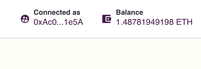
One way to ensure your users don't slip up is through passive, yet persistent, nudges in your UI. You could:
- show a user what network they're on
- show a user what account they're connected with
- show a user their current balance

Intentional friction
We recommend some intentional friction that forces the user to double check the details of their transaction. With Ethereum so early on and so experimental, it's vital to protect your users as much as possible. So even though most design advocates for fewer clicks, more clicks to create more confidence and reduce errors in a transaction seems like a good trade off.

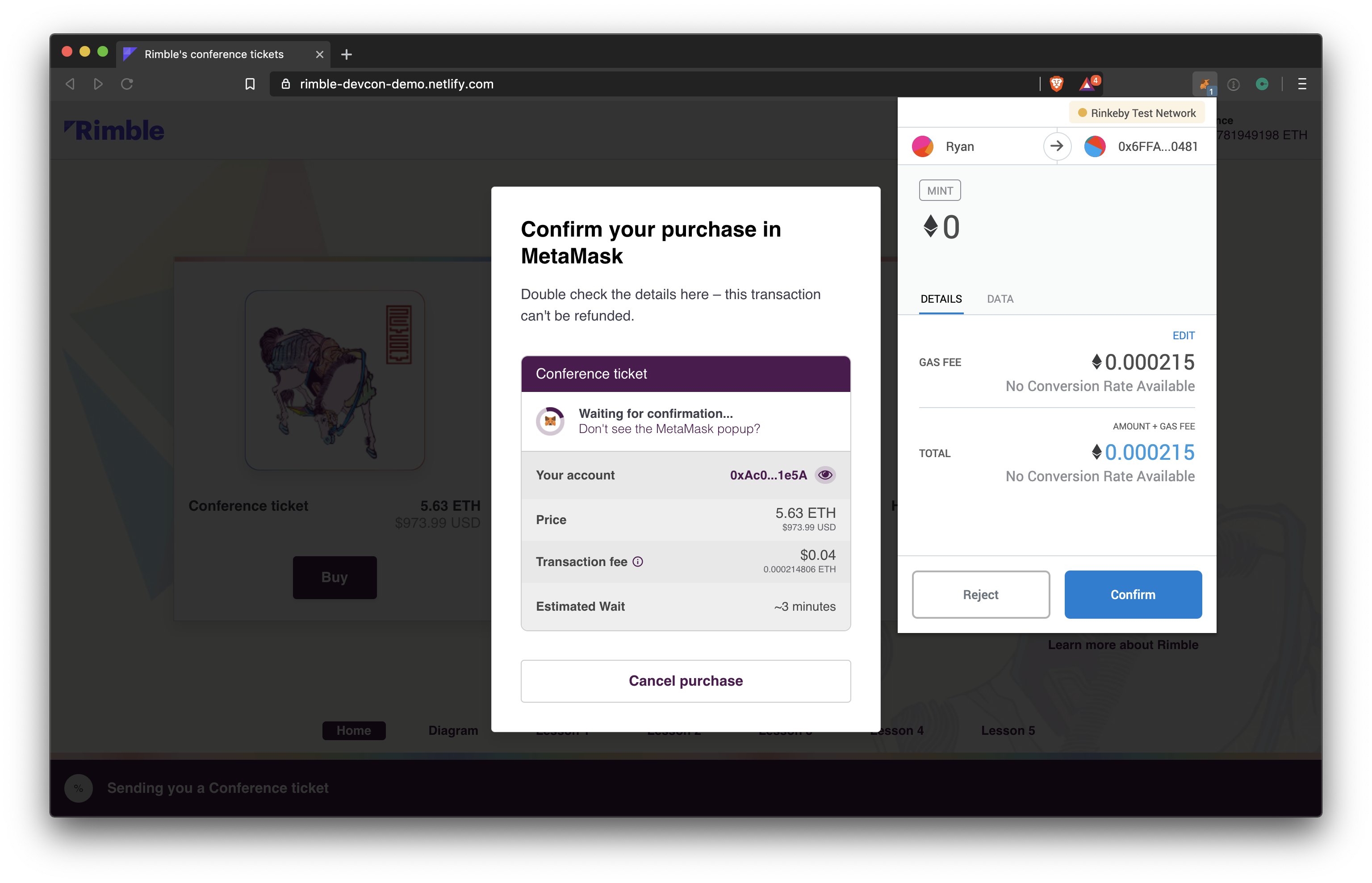
When we tested our demo with users we introduced a "checkout" screen that gave users a chance to confirm everything was as expected.
On this screen users can:
- double check their account details
- see that it can't be refunded
- cancel if they change their mind
And especially on desktop, users of WalletConnect or MetaMask can use this screen to cross-reference what they are seeing on their wallet versus what your dApp is telling them.
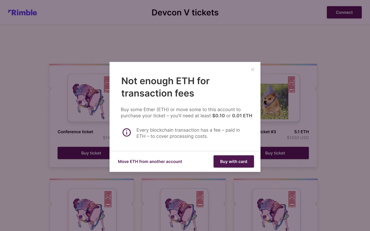
If the conditions weren't right, like if a user didn't have enough balance to pay the transaction fee, we would intercept this screen with an error modal. This allows the user to focus on one thing at a time.

All of this is about making sure the user meets all the right conditions to transact successfully. And they only press that Confirm button when they're 100% sure everything is as it should be.